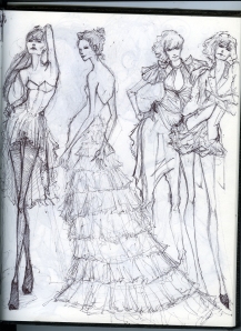
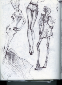
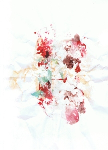
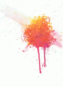
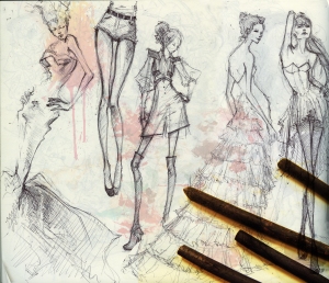
I scanned two sketches from my sketchbook and then took a photo of some willow charcoal I had. The image was a little plain so I also included some watercolor textures I found for free on the internet. I do like the combined images since it makes an interesting composition, but I personally like my sketches to stand on their own without any fancy editing.
Used the same photo of Mt. Hood that I used in the last post to edit. I can’t say I’m terribly happy with the end result, since I did a messy job with the clone stamp tool, but the finished image is pretty different from the original so I’m pleased with that.
I simply adjusted the contrast and played with the color adjustments, and then I used the clone stamp tool to clear out the clouds in the sky. The edited picture is a lot brighter and easier to read than the original. I did leave behind a strip of clouds that overlapped the tip of the mountain, but I got crazy with clone stamping and decided to remove all the clouds. I should have left it behind though, I think it would have looked better, but at least now I know to save multiple files of my work.
I love love the graphic design for Gdragon’s live concert album CD. Gdragon (GD) is a korean singer who is part of a band called Bigbang, which is under YG Entertainment. Of course, I’m pretty much biased with anything involving Gdragon, but I was pretty giddy when I saw how they designed the CD. YG has always been really good with how they design and package their stuff, but this graphic is just so clever, and I love it when they work with the shape of the object instead of just stamping on an image. The circular shape of the apple fits nicely in the circle shape of the CD. The graphic is an apple shape because the apple appears throughout many of GD’s pictures and videos for the album. The apple’s red color and shape resembles a heart, and because the album title is called Heartbreaker, we often see images of a bleeding apple with a bullet through it. So the hole in the CD actually sits where the bullet hole would be in the apple. Clever, right? The words Shine a Light, which is the name of the solo concert, is curved around the shape of the apple, thereby creating the shape of the apple. The lines created by the letter shapes and spacing also enhances the illusion of the apple, and the white background frames the apple, separating it from the reflective surface of the CD. I thought leaving the reflective surface of the CD around the apple was also a nice touch to the overall design. I just thought it was so clever how the designers took elements from GD’s album to design and shape his graphic for this CD. Plus, the packaging is really nice, too. It’s weird to think that this is just the concert album and not the actual Heartbreaker album (which by the way, looks awesome). Anyways, I look forward to seeing anything Bigbang releases, not just for their songs, but also to see a lot of the graphics they use.
Welcome to WordPress.com! This is your very first post. Click the Edit link to modify or delete it, or start a new post. If you like, use this post to tell readers why you started this blog and what you plan to do with it.
Happy blogging!
